|
With Pam Kemp
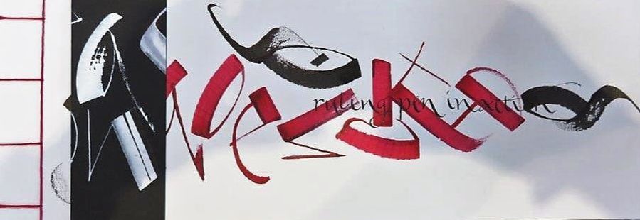
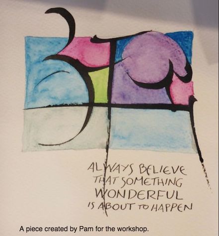
When I heard that Denise Lach had released a new book Journeys in Calligraphy, Inspiring Scripts from around the World, I was super excited. When I heard that Pam was running a workshop based on Denise’s new book I knew I just had to go along. At the start of the class Pam handed out the workshop notes and included in this was the exemplar for the Devanagari (pronounced dev-nagri) script. Pam gave an introduction to the class and we began by copying some of the Devanagari characters with a large nib. We were instantly aware of how difficult it was to recreate the characters comfortably, given the slant of the nibs we were using, so we did our best to get as close as we could to the real thing on the exemplar. After this warm up exercise Pam asked us to choose our favourite character and invited us to then play with it. By this she meant that we could manipulate the character and exaggerate parts of it. Perhaps have one of the lines far bigger than shown on the exemplar, or maybe make it much smaller. We had a lot of fun with this and we were able to let our hair down and get creative with expressive strokes using our nibs. The next part of the exercise saw us swapping our nibs over for ruling pens, pipettes a syringe or whatever took our fancy. We had to write the same character to see what effects we could achieve. It was very liberating to work so freely and expressively, and I went through gallons of ink in the process. Pam asked us to choose our favourite design and draw a rectangle on a piece of paper approximately 110mm wide x 70mm high. Using our favourite writing tool from the previous exercise, we had to write one of the characters, extending part of it outside the rectangle and use varying line weights to create interest. She explained that we should be aware of the space in the rectangle—Western tradition aims to try and fill a space whereas the Eastern tradition is to empty the space. We rotated the page clockwise three times, each time writing the character in a different size whilst being mindful of the space created in the rectangle. If we had time we could colour in the spaces created by the lettering and some beautiful pieces emerged as the afternoon progressed. We continued to play with the characters and some interesting designs were created. I especially liked the idea of writing the character once and rotating the page 90 degrees clockwise to write it again, trying to overlap a couple of the lines. Then with a foam roller, roll over the characters using the dirty water from the ink. This created a wonderful effect and Angela’s finished piece was very striking. At the end of the afternoon we pinned our work up on the wall and admired everyone’s hard work. It was great to see all the different styles created in the three hours that the workshop ran. I was so inspired by this class I actually practiced more of it the following weekend and a big thank you to Pam for running this fabulous workshop.
0 Comments
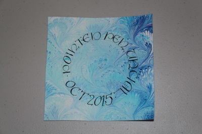
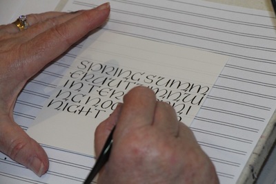
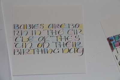
The letterform Christine developed arose from doodling, as many of these things do! She decided it might be fun to write letters informally without needing to lift the pen. We used felt pens at the workshop but you can also try this Snazzy Single Strand Script with various nibs that have a rounded rather than chisel end which give a monoline.
OK, so it may not be calligraphy as such but we all love working in ink. I found these title sequences to Marco Polo the most beautiful I have ever seen. I hope you enjoy it as much as I did.
https://vimeo.com/114350322 With Angela Hillier At Anything But Nibs students were encouraged to make marks on a variety of papers that were supplied. We used the following objects to make marks:
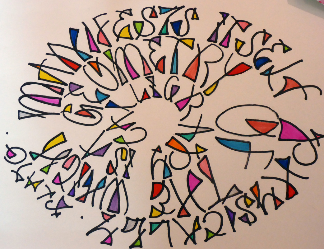
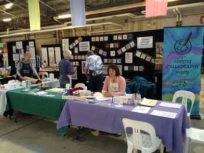
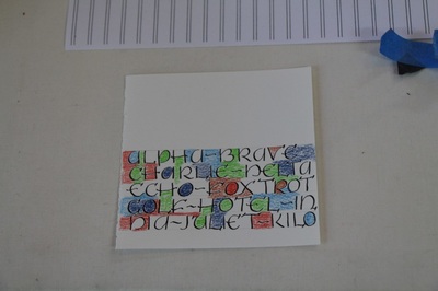
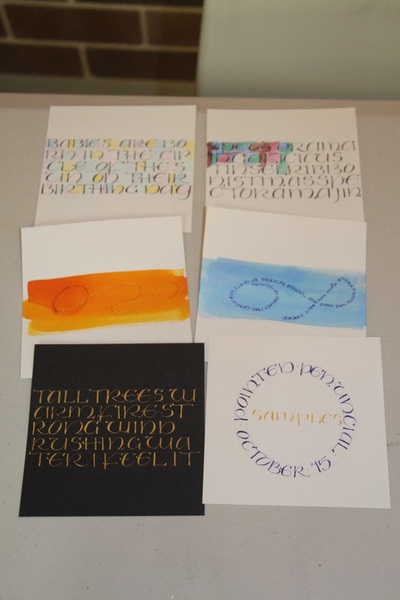
Two texts were provided and many interesting effects were obtained. It was an interesting and inspiring workshop and everyone thoroughly enjoyed the afternoon. It started with an envelope between two talented people communicating across the world, who participated in an envelope exchange group. Jenni contacted Betty and was given permission to use her script for our workshop. So a big shout out and thanks to Betty. The feature of this script is that each letter exists within a box, with the box being part of the design. The letters can be straight in the box, or at an angle. Templates: small cardboard squares, small plastic squares (made from overhead film) Exercise 1--using light card Draw 2 lines 1.5cm apart then make 1.5cm boxes with a 0.5mm gap between them. Then try the same size boxes again, using different angles, so it looks like each box is leaning on one another. Now draw the letters in the boxes, making sure some parts of the letters touch the outside of the box, as in the illustration in the previous column. Next step is to take a dark, fine point black permanent marker and using the square template, trace around the template by hand. Do not use a ruler to do this. When adding colour, we first coloured in both the letters and the backgrounds, before outlining using a black outliner/marker. Use a light coloured pencil to colour in, then outline in black. The reason for this is if you go over the black line, the viewer will see the pencil on top of the black line, and really who stays within the lines. Colour the word using coloured pencils to outline the letter using the Tex Mex script. Inside the letter do some doodles, people may know this as Zentangle©. Mix it up with colour, design and movement of the boxes. TIP—tip the ruler over so that the bevelled edge is face down on top of the paper/envelope. This avoids smudging the black ink onto the paper when the ruler is moved. Exercise 2--using beautiful chrome leather We wrote on a piece of leather, that Jenni provided, with white paint, sharpies or gouache. If using gouache you will need Gum Arabic to bind it. Gum Sandarac powder will prepare the surface before you write on it. Do your design with a square within a square, and then add your Tex Mex letter. Don’t forget to add a fixtative at the end to ensure it remains on the leather. Cherrie Grant Last weekend at the Kingston Old Bus Depot Canberra Calligraphy Society had a stall, along with many other community groups from all around the ACT.
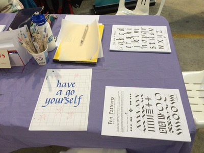
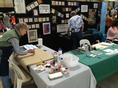
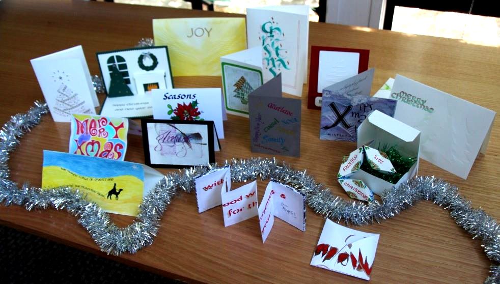
It was an opportunity to showcase calligraphy in the National Capital and to let people 'have a go'. Many people stopped and asked for book marks or had a go at calligraphy for themselves. One couple only came to the Expo because they saw that we were going to be there on our website (!) and they wanted to find out about calligraphy in Canberra! Many beautiful and original Christmas cards were produced by the members of the Canberra Calligraphy Society to exchange with each other at the annual Christmas party. Click here to see the individual photos.
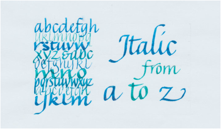 Our final workshop for this year will be held on Sunday November 22nd from 1.30 - 4.30 Jill Robertson will take us through the basics of Italic script and then for those who want a challenge there will be encouragement to play with the script. Jill also has a special project to use Italics. It won’t be hard, it will be fun, so do come along. Register with Christine Wilde 6231 9922 cm.wilde@bigpond.net.au The CCS Exhibition for 2015 was officially opened at the Hellenic Club last night by Gemma Black, renowned Calligrapher.
Prizes were awarded due to the generosity of Steven Brown owner of Bespoke Framing in Phillip. Have a look at the slideshow of the exhibition and find out who the lucky winners were under the tab CCS Exhibition 2015. |
Canberra Calligraphy Society Inc.
Like-minded people with a passion for calligraphy. Archives
January 2020
Categories
All
Inspirational People & Places
Gemma Black |
|
|
 RSS Feed