|
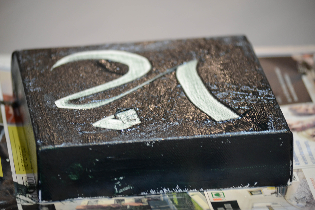
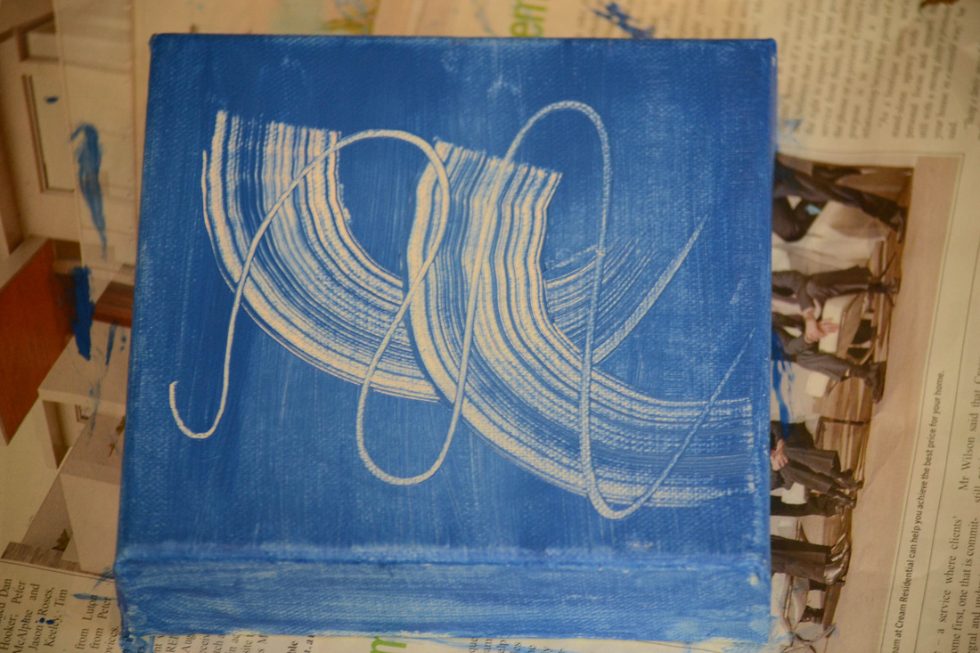
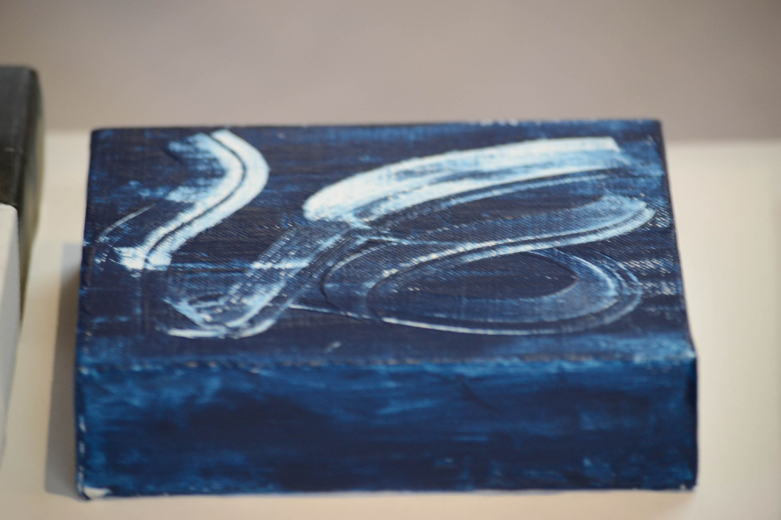
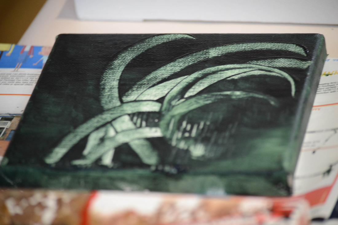
Pam led us for a workshop using different mediums on prepared canvas. It was a great day playing on canvas instead of paper, the traditional surface for modern calligraphy. She first told us how to prepare canvas with a gesso to make the surface receptive to different treatments. 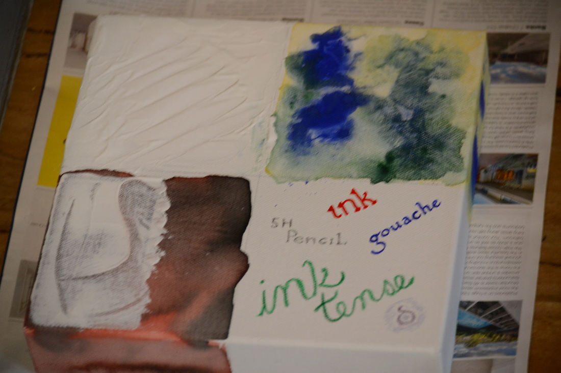
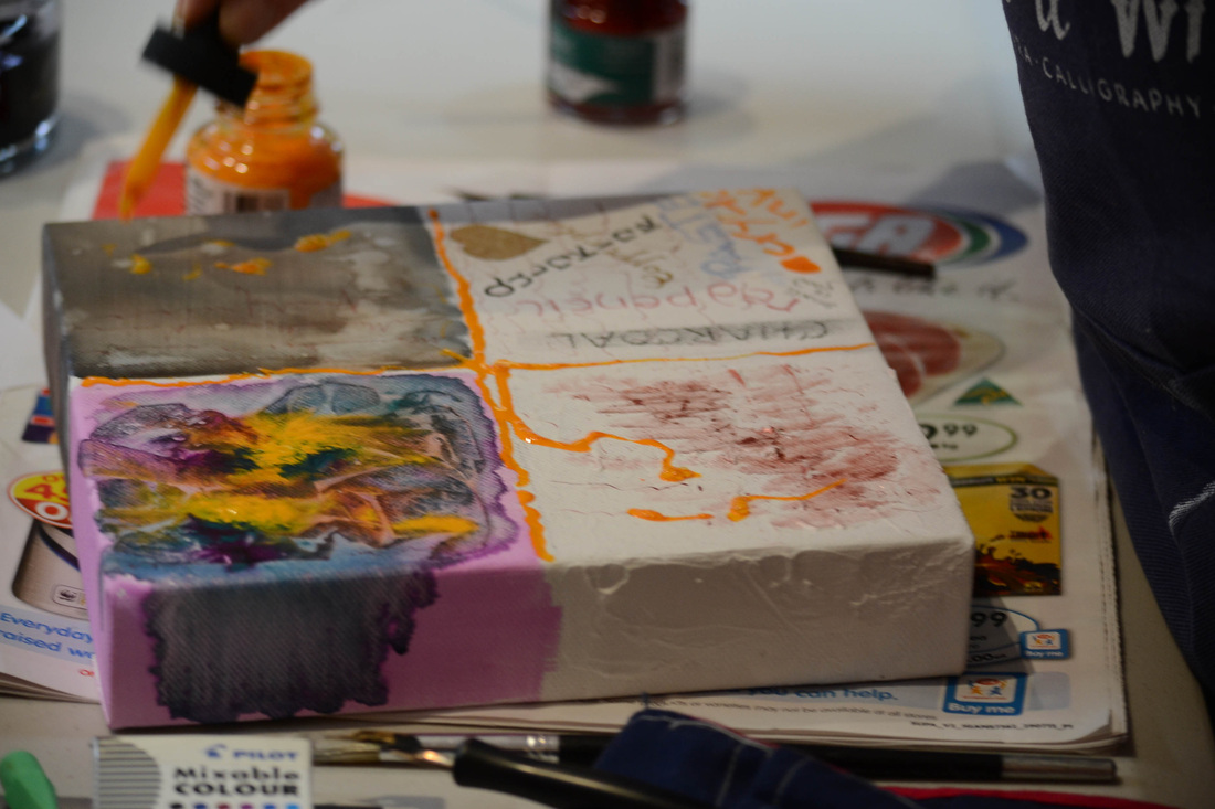
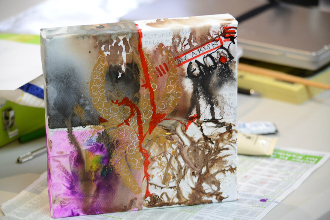
We divided a mounted canvas into quarters and used various washes of ink and gouache, gold and sculpting textures. It was such fun playiing. thanks Pam.......
After that we used a small canvas and prepared it with a dark gesso and used balsa pens to make some great marks upon it, by removing the wet surface.It was such fun playiing. thanks Pam.......
0 Comments
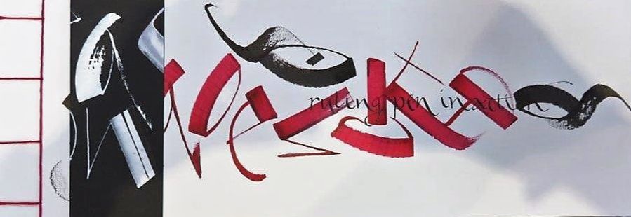
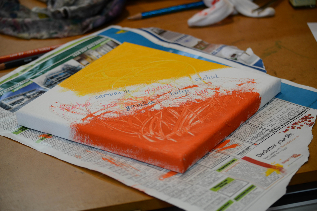
On the 23rd June Marg gave a workshop on practical flourishing Italic, Copperplate and Spencerian scripts. Report by Marg Peachey A flourish is a decorative touch that breathes life into words. It energises a page and makes your letters truly unique. Linda Hutchinson – 3rd Manual for the Calligraphic Arts A flourish is the ornamental embellishment of a letter or letters. Diana Hardy Wilson – Encyclopedia of Calligraphy Techniques Flourishing can be attached to letters to on ascenders, descenders, double letters, end of words and capitals. Flourishes should not be tight (like a spring) and have a nice lot of space in their counter shapes. They should not obscure or 'bash into' other letters. Practise / warming up is important before executing a flourish so that it looks as though it belongs. It becomes part of a letter and not an 'add on'. They should flow freely and be incorporated into the whole design. Strokes supporting a flourish should keep their integrity within the x height margins. At the end of a flourish the pen can just stop or the nib manipulated to produce a stylish, but not excessive, finish. Less is more with flourishes and should be limited on once or twice in a word. 
Where else to find some flourishes but other calligraphy society's logos!! 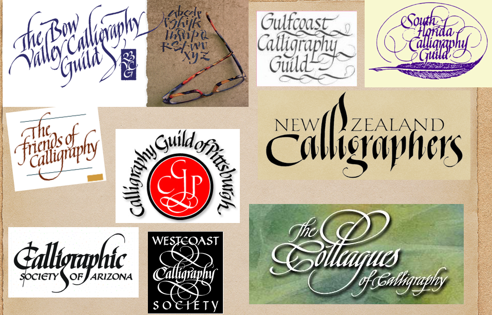
I hope everyone learnt a lot.
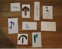
I noticed that some of the basic principles of lettering need to be revised. Will leave that until another time but it has to do with the shape of the mother letter, O. Both copperplate and italic are cursive scripts which makes this shape all the more important. Character building workshop with Jill Robertson Who designed our letters? I know they went through a series of evolutionary phases before getting to the recognisable letters we know as our alphabet, but at some time someone said they liked the look of a certain shape. To describe how to put a letter together you could describe A as two diagonal lines meeting at the top with a crossbar half way down – or some such. Our workshop for April was all about making up your own series of symbols from a given description. I gave the description and all the students made a dozen or so possible interpretations of my words. As an example I started with “ A straight line and 2 dots” My examples were: 
Then the students got to work. A couple of the descriptions I gave them were:
There were some fantastic results and much fun was had by all. It was not a deep and meaningful workshop, but was lots of fun.
|
Canberra Calligraphy Society Inc.
Like-minded people with a passion for calligraphy. Archives
January 2020
Categories
All
Inspirational People & Places
Gemma Black |
 RSS Feed