|
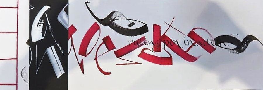
Elaine Witton workshop 23-24 November 2019 Day 1 Elaine’s inspiration for this workshop began when, through a family connection, she was given a box containing the calligraphic samples and work of Ismar David (1910-1996), a prolific German calligrapher, type designer, illustrator, architectural designer and educator. Elaine was attracted to a script which David simply labelled “a seventeenth century script”. David had trained in the decorative arts in Berlin in the 1920s and early 30s, emigrated to Palestine in 1932 to undertake a book design project. He stayed on another 20 years before moving to New York in 1952, living there until his death in 1996. He is remembered for amongst other things, designing a Hebrew typeface. Further information about the life and work of Ismar David can be found on the Ismar David Archive at www.shunammite.com/idea The workshop began with each participant tracing the lower-case letters of the exemplar, having made their own choice of nib. The class then split into small groups to carefully examine the exemplar. We noted the pen angle, the shape of each letter, the several alternatives for each letter, the white space (negative space) in counters and loops, the exaggerated ascenders and descenders, the appropriate x height, inconsistencies in slopes or shapes, the fine straight hairline uprights, contrasting bold downstrokes and so on. We had much to choose from as David had provided both a flowery, spidery version, and a more chunky, more dense version of the script. David had suggested that the script could be used with either a pointed pen or a broad nibbed pen. We then scribed whole alphabet phrases. Almost everyone in the class was guilty of having too heavy a touch. Elaine told us to relax, lighten our touch and to move the paper around. Some had difficulty with ink which was too thick for the small nibs were had chosen, some had nibs which needed encouragement. For those struggling with paper, Elaine suggested a new Canson product called “Marker” XL. A 70gsm, satin feel, bleedproof, semi-transparent, layout paper suitable for pen, markers and pencil. After lunch we tackled the capital letters and for these we needed a bigger nib. Many letters resembled Gothic script and some were especially complex and almost illegible. Elaine told us to ‘mix and match’ and choose our favourites, just as David had done. It was clear that the letters in his exemplar were far more controlled and rigid than those he used in his text. Elaine reminded us that the complex capitals which require a larger nib, often need several more pen strokes compared to the lower case letters. We played with the capitals, writing names and phrases. When we struggled with complexity and spacing Elaine reminded us to think about where we wanted our letters and words to finish, to take the time to plan. The afternoon finished with a fun project. Each person designed their own personal monogram and after scribing this onto a disc of good quality paper we placed it into the lid of a Moccona coffee jar to create a unique personal paperweight. Day 2 On this second day of the workshop the group got down to some serious work as we were introduced to the function and use of pointed nibs. Briefly, pointed nibs came into their own when printing replaced the making of books by hand. This occurred at the end of the Renaissance period in the 17th century. The pointed nib differs from the edged nib in that the latter produces a modulated line varying in thickness, with variations made by the direction in which the strokes are made. The pointed nib makes a thin fine line of constant thickness, referred to as a monoline. If a thicker stroke is required then it is necessary to push gently down on the nib in the process of writing, the ends of the pointed nib will gently open, producing a thicker stroke. It is harder to control the flow of ink in a pointed nib and some people used a paint brush to apply the ink or gouache. This took a lot of concentration from the workshop participants and they probably hold the record for the longest quite period of any workshop, so absorbed were people that morning coffee was almost missed! Pointed nibs recommended were: Braus 66EF, a particularly flexible nib and the one most used in the workshop; Zebra G; Mitchell Elbow; and Nikko G. Pointed nibs are easy to recognise as they have an elegant appearance and a slot or slots on the sides or top. It is the slots which give the nib its flexibility to draw fine lines. Oblique penholders are normally used with pointed nibs, but straight ones can also be used. Elaine said the best paper to be used with pointed nibs should be bleed proof and “smoothish”, but if too smooth the nib will slide. Having mastered the pressure required to use the pointed nib, the group settled down and rose to the challenge of producing interesting work. The first project involved using a compass to draw a half circle of 12 cm radius and drawing three lines within it. Each of the three lines had to start from one of the edges of the half circle and could end at an edge of the half circle or on one of the lines already drawn. Two colours were to be used, one had to be black. Words were then written along the lines, the half circle and the bottom line of the half circle. People were free to draw the lines in any shape or style they wished provided they met the above requirements. For the second project, each member of the workshop was given a piece of paper that was actually a piece of a jigsaw made by Elaine. Each person had to draw lines to divide their piece of the jigsaw into three sections and write botanical descriptions of Australian native plants or trees in each section. The final jigsaw had a path running through it and, if any of the group had a piece with a path running through it, this had to be left clear. A different sized nib and colour had to be used for each section. At the end of the workshop, all the jigsaw pieces were placed on a table and the group set to the hard part of the day, putting the jigsaw together! The completed jigsaw will be sealed, laminated and displayed at Canberra Calligraphy Society’s future exhibitions and events. The group’s thanks go to Elaine for a challenging and interesting workshop. For many participants it was their first introduction to the pointed nib and for some it will become one of their preferred pens. One person swore she would never use a pointed pen again! Its inclusion of the Gothic style in its letters made it an interesting script, without the formal and heavier appearance of the Gothic style.
0 Comments
Leave a Reply. |
Canberra Calligraphy Society Inc.
Like-minded people with a passion for calligraphy. Archives
January 2020
Categories
All
Inspirational People & Places
Gemma Black |
 RSS Feed